Shape Visualization
This example demonstrates how spectrogram data can be visualized as interactive shapes, with spheres as the default, in a 3D space using the spec-cluster package. The user can select individual or multiple entities and interact with them through the custom UI components.
Key Features
Selection Context
The Selection context tracks which spectrogram entities are selected when a user clicks on them. It supports two modes of selection:
- Single Select: Clicking on a single entity selects it.
- Multi-Select: Holding the
Shiftkey while dragging creates a marquee, selecting all entities within that marquee.
The selection is managed by the Selection.Provider, which tracks the selected entities in a set.
  export const Provider = (props: ProviderProps) => {
  const [selection, setSelection] = React.useState(defaultContext.selection)

  const updateSelection: Context["updateSelection"] = filenames => {
    const next = new Set(selection)
    for (const filename of filenames) {
      if (next.has(filename)) next.delete(filename)
      else next.add(filename)
    }
    setSelection(next)
  }

  const clearSelection: Context["clearSelection"] = () => {
    setSelection(new Set())
  }
}
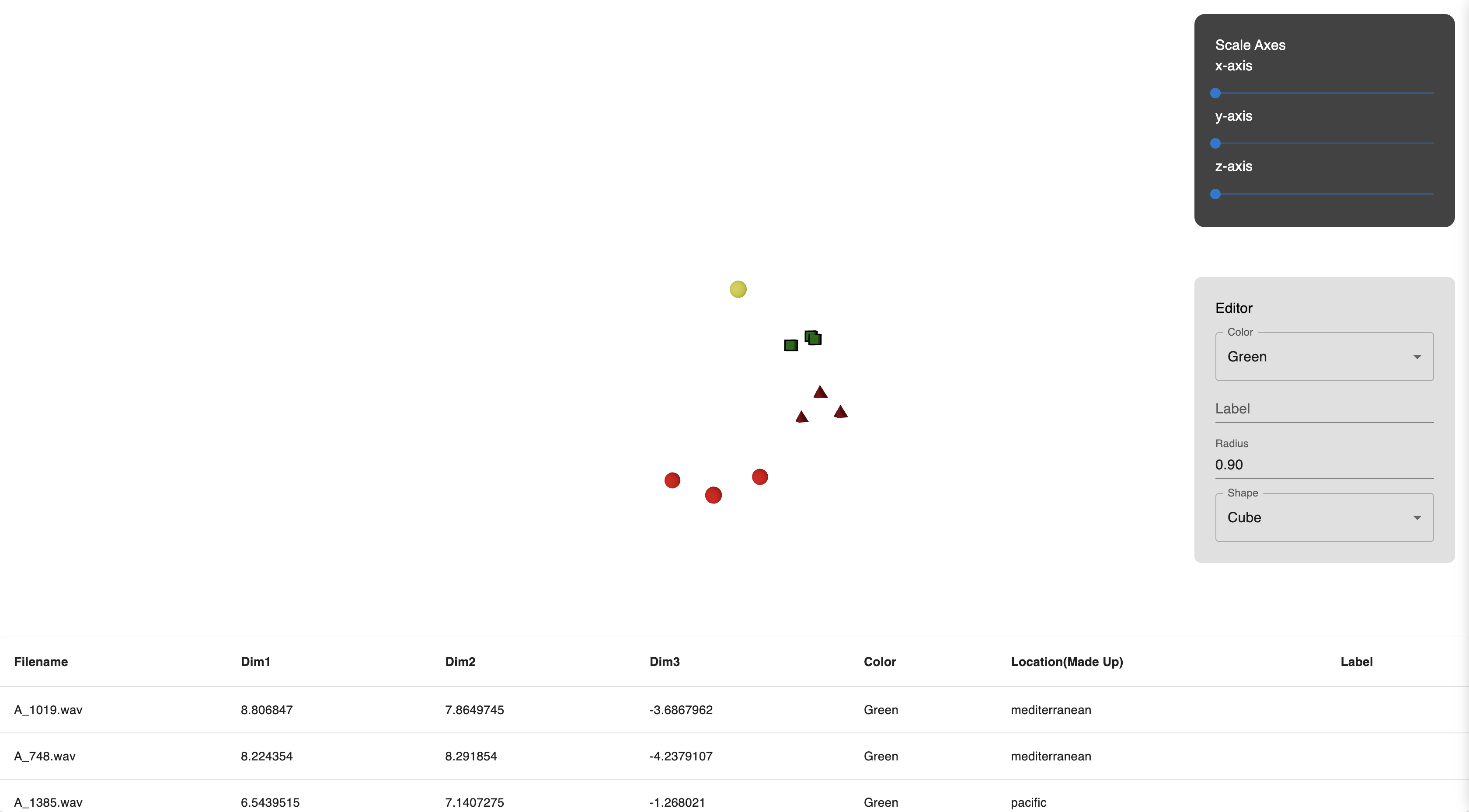
These selected entities can be further manipulated via the custom Multi-select Editor.
Multi-select Editor
The Multi-select editor is a local UI component that allows users to modify the properties of selected entities. Once an entity is selected, this editor provides options to adjust:
- Color: Change the color of selected entities.
- Size: Adjust the size of selected entities.
- Label: Add or modify the label for the selected entities.
- Shape: Change the shape of selected entities, with the default shape being a sphere.
This component is displayed only when one or more entities are selected.
Table View
The Table view component is another local UI element that displays a list of selected entities in a table format. It provides detailed metadata about the selected entities, including:
- Filename
- Dimensions
- Optional metadata like color, size, and label
This gives users a comprehensive overview of all selected entities and their properties.
Scene Component
The Scene component renders the spectrograms as spheres (default shape) in a 3D space, using the renderMode prop set to dot for this demo.
-
renderMode: Set to
dotto display spectrograms as spheres (default shape). Theimagemode is covered in the Spec visualization example. -
onSpecClick: Handles entity selection by updating the
Selectioncontext. When an entity is clicked, its filename is added to or removed from the selection. -
controls: These allow for adjusting the camera view of the 3D scene, offering flexibility for users to pan, zoom, and rotate:
<Scene
  ...
  controls={{
    minAzimuthAngle: -Math.PI / 4,
    maxAzimuthAngle: Math.PI / 4,
    minPolarAngle: Math.PI / 6,
    maxPolarAngle: Math.PI - Math.PI / 6,
    maxDistance: 120,
    minDistance: 5,
  }}
  ...
/>
Users can modify these controls to suit their preferences for how they interact with the 3D environment.
Configurator Context & Interface Component
The configurator context works with the interface component to allow users to adjust the position of the spectrograms in the 3D space using sliders. These sliders modify the x, y, and z axes.
For more details, refer to the Configurator context and Interface component documentation.
Error Handling
The demo includes basic error handling through react-error-boundary, ensuring that any issues are caught and a simple error message is displayed. Users can retry after an error occurs.