Spec Visualization
This example demonstrates how clustered spectrogram images can be rendered in the 3D space using the spec-cluster package. Users can focus on individual spectrograms, view their details, and interact with them in a 3D scene.
The demo utilizes various contexts to manage interactivity, such as focusing on specific spectrograms and adjusting the position of spectrograms in the 3D scene.
Key Features
Focus Context
The Focus context manages which spectrogram is in focus when the user interacts with the 3D scene. Clicking on a spectrogram triggers this focus functionality, allowing the user to view detailed information about that spectrogram.
-
The focus context is provided via
Focus.Providerand handles which item is focused by setting the clicked spectrogram as the focused item:export const Provider = (props: ProviderProps) => {
const [focusedItem, setFocusedItem] = React.useState(defaultContext.focusedItem)
const unsetFocus: Context["unsetFocus"] = () => {
setFocusedItem(null)
}
const hasFocus: Context["hasFocus"] = focusedItem != null} -
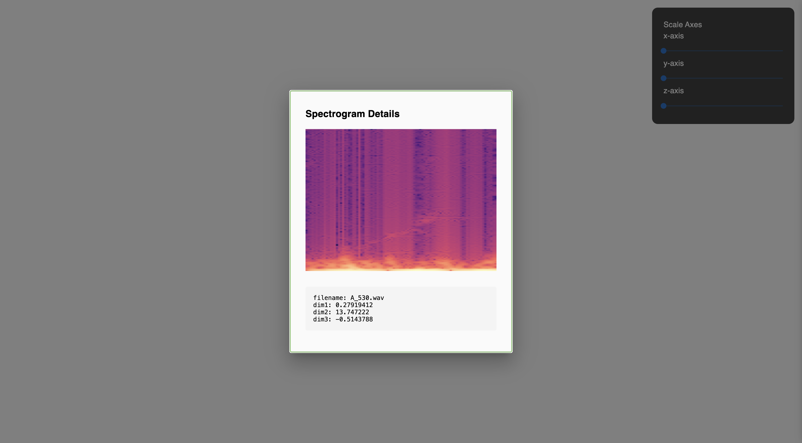
Once clicked, the spectrogram's details are displayed through a custom UI component, FocusModal.
Focus Modal
The Focus modal is a custom component created specifically for this demo. It displays detailed information about a spectrogram when it is clicked. The modal retrieves data from the focused item in the focus context and dynamically updates whenever a new spectrogram is selected.
Scene Component
The Scene component renders the spectrograms in 3D space and handles user interactions with the scene. In this demo, the spectrograms are displayed as images by setting renderMode to image.
-
renderMode: Set to
imagefor this demo to render spectrograms visually as images. Thedotmode is covered in the Shape visualization example. -
onSpecClick: When a user clicks a spectrogram, this event is tied to the focus functionality, triggering the focus on the clicked item.
-
controls: Adjustable camera and navigation controls allow users to zoom, pan, and rotate the 3D view. These controls can be modified by altering the
controlsprop:<Scene
...
controls={{
minAzimuthAngle: -Math.PI / 4,
maxAzimuthAngle: Math.PI / 4,
minPolarAngle: Math.PI / 6,
maxPolarAngle: Math.PI - Math.PI / 6,
maxDistance: 120,
minDistance: 5,
}}
...
/>
Configurator Context & Interface Component
The configurator context works with the interface component to allow users to adjust the position of the spectrograms in the 3D space using sliders. These sliders modify the x, y, and z axes.
For more details,refer to the Configurator context and Interface component documentation.
Error Handling
Basic error handling is implemented using react-error-boundary. If an error occurs (e.g., misformatted data), a simple error message is shown, allowing the user to reload the demo.